 React Bootswatch Select
BootswatchSelect
Description
A drop-in Bootswatch theme selector.
Supports three modes:
- Selector visible: A
selectelement is rendered that allows the user to choose a theme to use. Dynamically swaps CSS out of head based on selection. - Selector hidden: Provide a
selectedThemeNameprop along withselectorHiddenand the provided theme will be used on the page. Adds CSS to head only. It doesn't matter where on the page this component is placed since noselectis rendered. - Display-only: Provide the
disableHeadLinkprop to disable the CSSlinkinhead. Turns this into a plain oldselect. UseonChangeto listen for selection.
By default, the themes load from bootstrapcdn.com. See the Props section below for additional options.
Bootstrap must be loaded first. You can use the included Bootstrap component to easily load from the CDN if you'd like.
Usage
Selector Visible
import { BootswatchSelect } from 'react-bootswatch-select';...<BootswatchSelect version={'4.4.1'} className="form-control" />
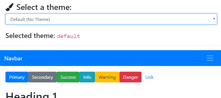
This renders a select containing theme name options for the Bootswatch version specified.
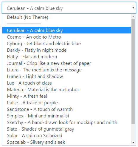
Here it is shown expanded below:
Selector Hidden
import { BootswatchSelect } from 'react-bootswatch-select';...<BootswatchSelect version={'4.4.1'} selectedThemeName="cerulean" selectorHidden />
The above code will use the cerulean theme (see Theme Names below for all options).
No visible element will be rendered when selectorHidden is used. As such, this can be placed anywhere.
Display-Only
import { BootswatchSelect } from 'react-bootswatch-select';...<BootswatchSelect version={'4.4.1'} disableHeadLink />
This will render the select only and will not dynamically add the selected theme CSS link in the head.
Props
| Prop | Type | Description |
|---|---|---|
| version | string | The version of Bootswatch to use. Required, but will fall back to 4.4.1 if not specified. See bootstrapcdn for the latest CDN version. |
| selectedThemeName | string | undefined | Selected theme name. Defaults to default |
| selectorHidden | string | undefined | Whether or not the selector is hidden. Specify true to hide. Defaults to false |
| cdnLocation | string | undefined | Location of the CDN. Defaults to https://stackpath.bootstrapcdn.com/bootswatch/ |
| themeFilename | string | undefined | CSS theme filename. Defaults to bootstrap.min.css |
| disableHeadLink | boolean | undefined | Set to true to handle importing the styles yourself (no link will be added to head). Turns this component into a plain old select. Default false. |
In addition, all React HTML props for the select tag are supported (such as onChange, className, etc).
Theme Names
The theme name options are as follows:
default— Basic Bootstrapcerulean— A calm blue skycosmo— An ode to Metrocyborg— Jet black and electric bluedarkly— Flatly in night modeflatly— Flat and modernjournal— Crisp like a new sheet of paperlitera— The medium is the messagelumen— Light and shadowlux— A touch of classmateria— Material is the metaphorminty— A fresh feelpulse— A trace of purplesandstone— A touch of warmthsimplex— Mini and minimalistsketchy— A hand-drawn look for mockups and mirthslate— Shades of gunmetal graysolar— A spin on Solarizedspacelab— Silvery and sleeksuperhero— The brave and the blueunited— Ubuntu orange and unique fontyeti— A friendly foundation
You can specify an initial theme using the selectedThemeName prop, and can handle selection changes using select's onChange event.
A BootswatchSelect renders as a select element when visible.
Examples
See the Storybook demo for a live example.
Selector Visible
<BootswatchSelect version={"4.4.1"} className="form-control" />
This select will dynamically add the theme CSS link in the head when a Bootswatch style is selected.
Selector Hidden
<BootswatchSelectversion={"4.4.1"}selectedThemeName="cerulean"selectorHidden/>
This will add the Bootswatch CSS theme selected in the head and not render the select on the page.
Display-Only (No Head Link)
<BootswatchSelect className="form-control" disableHeadLink />
This will render the select only and will not dynamically add the selected theme CSS link in the head. It just becomes a plain old select. Use onChange to listen for selection changes.