 React Analytics Charts
Charts Overview
For your convenience, you can choose from 10+ commonly used drop-in charts, or create your own data queries for bar charts, column charts, geo charts, line charts, pie charts, and tables.
To use a chart, render it with an AnalyticsDashboard, which handles loading the Google Analytics Embed API, sign in and sign out, and view selection. You can also embed standalone charts.
Common Charts
Choose from these pre-made charts for common queries:
- ActiveUsersChart - Visualize userbase growth over time.
- BounceRateChart - See how well a site grabs people's attention.
- OrganicSearchesChart - Visualize traffic from organic searches.
- PageViewsPerPathChart - See which pages and posts are most popular.
- PagesPerSessionChart - See how engaged users are.
- SessionDurationChart - Visualize how long users stay before leaving.
- SessionsByDateChart - See how traffic grows over time.
- SessionsByDeviceCategoryChart - See how users consume content.
- SessionsByHourChart - Know the best time to post content.
- SessionsBySourceChart - See which sites traffic comes from.
- SessionsByUserTypeChart - See the proportion of new and returning visitors.
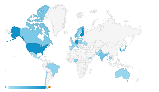
- SessionsGeoChart - Visualize where in the world visitors come from.
See each chart for examples, information on usage, and the data queried by each.
Custom Charts
You can build your own charts if you want. Just choose from the following chart types:
BarChart - A bar chart shows data as horizontal bars.

ColumnChart - A column chart shows data as vertical bars.

GeoChart - A geo chart shows data on a map of the world.
LineChart - A line chart shows data as points connected by lines.

PieChart - A pie chart shows data as slices of pie (or donut).

TableChart - A table with rows of data under sortable labeled columns.

Just provide the chosen chart type with the data query and optional chart options.
See each chart type for examples and usage information.
DataChart
A DataChart is the base chart used by all of the above charts. It requires a query and chart configuration, and uses the Google Analytics Embed API to inject the rendered chart into a container on the page.
Each of the custom chart types above wraps DataChart and handles configuring the chart prop of DataChart for you.
You probably won't need to use a DataChart directly since all chart types are available as their own components above, but you will definitely want to refer to the Query Prop section of the DataChart documentation for creating queries for any custom charts you want to build.